How this brand strategy firm rebranded its own website
We rebranded our website!
Often, when companies refresh/rebrand/rebuild their websites, this is the sort of announcement they make. You might see a post or two on social media about it, they might share the news with their email lists, and they will frequently write a blog post to go along with it. Kind of like the post you’re reading right now.
And those are all awesome ways to share the news!
In fact, we were going to do exactly that with this very post. But then we thought, “Hey! We’re a brand strategy agency. Let’s share the process we used to rebrand.” We’re excited about the finished product, but we’re also excited about the journey we took to get there. So we decided to make a case study out of ourselves.
Read on to see how we took our own medicine to modernize our website, from layout to design to organization to copy, and learned something about ourselves along the way.
The Opportunity
The last time we substantially updated our site was in 2020. We added new illustrations, improved some functionality, created new landing pages, and refreshed copy throughout.

Our old homepage
The site was clean and to the point. As you can see, we proudly showcased an in-house illustration (one of our core competencies!), followed by simple options for a visitor to navigate to the specific service they were interested in. It wasn’t until after that drop-down menu that we had any copy about who we are and what we do.
Our thinking was that we wanted our site to be visitor-centric, allowing them to navigate as quickly as possible to internal pages, where they would hopefully reach out through a contact form.
There’s nothing inherently wrong with this approach. But over time, we realized it was wrong for us. We are a company with a range of related, but distinct services. How does social media relate to Wikipedia? We didn’t say, and the truth is: we hadn’t given enough space to thinking holistically about it to provide an answer.
It wasn’t the first time we realized that we we weren’t clear on how we talk about ourselves, both internally and externally. Like many creative consulting companies, we had grown organically more than strategically. So when we started to revisit the question last summer, we resolved not to punt on the question again. We needed to get clear on our brand.
And that, ultimately, was what prompted us to rebrand our site.
How we started our branding process
Over the years, we had developed three central service lines—design, social media, and Wikipedia. And while all three had thrived, we nonetheless struggled to explain how they connected. At a granular level, we understood these services in and out, but our website wasn’t effectively communicating why we offered them and why it matters.
So in 2021 we initiated a series of “change projects”; internal growth initiatives designed to surface our core values, purpose, and positioning. Long before we wrote a shred of copy for the new website, we committed to working together to find our core truths and express them through messaging we could all align on.
After years of helping clients with their own “Brand Strategy,” now we were doing it for ourselves.
When people hear the word “branding”, often the first thing they think of is a logo or brand colors. And this is right on the money—but it’s not the whole story.
Visual Identity vs Verbal Identity
A logo, brand colors, design standards, font families, iconography, and naming conventions make up what we call “Visual Identity”. They are literally how the world sees your brand, and they are crucial to your brand’s success. Done correctly, visual identity will:
Convey your brand’s personality
Connect with your brand’s audiences
Provide cohesion and consistency across touch points (website, social media, collateral, etc.)
Differentiate your brand from competitors
As the name implies, this is how you communicate what your brand is visually. There’s really no underselling the importance of a thoughtful, thorough visual identity.
Successful visual identity must be married to “Verbal Identity”. This comprises positioning, messaging, value proposition, and mission statement. In other words, how you talk about your brand. Done correctly, verbal identity will:
Convey your brand’s personality
Connect with your brand’s audience
Provide cohesion and consistency across touch points (website, social media, collateral, etc.)
Differentiate your brand from competitors
Notice the similarities between visual and verbal identity? It’s no coincidence; they are two sides of the same coin. Both of these identity systems work in tandem to give structure to the way you express who you are, what you do, why you do it, who you do it for, and why it matters.
How we approach Verbal Identity
The first step in a branding exercise is to assess where you are currently. That meant taking stock of our existing site, including layout, copywriting, illustration, and organization. This is a powerful exercise for two main reasons. First, it prompts you to really dig in and critically assess what isn’t working. Second, the process of grappling with points of inconsistency, weakness, and disorganization will organically produce a catalog of the aspects that are working. When you aren’t building from the ground up, it’s important to decide what is and isn’t successful, because you don’t want to throw out the meaningful work you’ve done in the past for no reason.
So we looked at the copy on our site, starting with the homepage. Our goal was to use that copy to answer some fundamental questions:
Who are we
What do we do
Who do we do it for
Why does it matter
Positioning, Messaging, Value Proposition
Our old site addressed those prompts, to varying degrees, as follows:
Who are we
the agency (that) leading brands (including more than 30 of the Fortune 500) and hungry upstarts call to tackle their biggest challenges
What do we do
breaking through the noise on social media, creating lead-generating content, or finally getting that Wikipedia article updated
Who do we do it for
leading brands (including more than 30 of the Fortune 500) and hungry upstarts
Why does it matter
meet core sales and growth objectives
This felt, again, okay. Not incorrect, exactly, but incomplete. This positioning just didn’t quite capture what we offer to clients in all its fullness. More importantly, it wasn’t effectively communicating that to our audience.
To uncover that, we zoomed out. Way out. For our brand positioning to make sense across our three primary service lines, we wanted to determine what core challenges our clients share. We put a deck together to document our work, and after several weeks of research, brainstorms, and conversations, here’s what we found:
What they all share is having a brand identity to build or a reputation to maintain, and needing outside experts to develop and execute creative content strategies designed to communicate effectively with their key audiences.
That is, across our clients and across our capabilities, the common thread is that we help our clients tactically express their brands.
Remember what I said earlier about not throwing out previous work? Well, we lived that maxim; after looking at what we do at a high level, we ended up returning to the very first tagline our agency ever used:
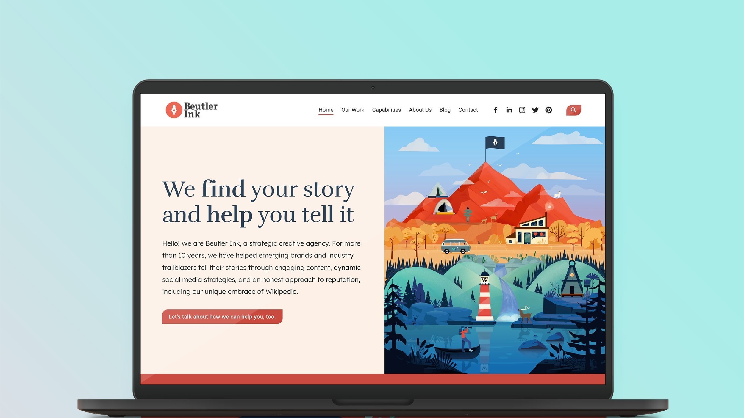
“We find your story and help you tell it.”
It was a good tagline when we first conceived of it; clear, direct, and client-oriented. But in our early years, it frightened us a little. In 2013, our staff counted less than ten, and we hadn't built out our full range of services yet. We didn’t fully believe that we could deliver on it. So we changed taglines a few times over the next few years, never quite finding one we liked as much. But our company grew, and now we have a staff of nearly 30, with considerably more expertise, experience, and a stronger set of capabilities. So the time was right. And even if no one outside our agency knows it, for us it's a kind of homecoming.
Applying brand positioning
So, we determined that we help brands express themselves. That’s great, but what’s next—how do we put that positioning into practice? How do we express our brand?
To figure this out, we listed just about all of the individual deliverables we offer, from improving Wikipedia pages to infographic design to creating social media content and all the myriad variations in between and extensions thereof. We knew that all of our services helped our clients manage their brands, but we wanted to see what additional taxonomy we could surface for our brand that would help clarify what we do.
Looking at that list of deliverables, it was immediately clear that the things we do for clients tend to fall into three broad categories, each representing a different “challenge” or “lifecycle stage”.
At a basic level, our clients need to create a brand expression (eg, develop a branding package); connect an existing brand to the appropriate audience (eg, create marketing collateral and develop social media strategies), or protect the online reputation of an existing brand (eg, via community management of social channels, Wikipedia and SEO approaches).
We boiled this all the way down to:
Create
Connect
Protect
Breaking your services down this way is a helpful exercise to make sure you understand how each of your deliverables fits into your clients’ worlds. Product-market fit is impossible without a clear-eyed declaration of the high-level challenge your service solves.
Having identified the three key challenges our agency addresses, all we had to do was map our deliverables onto those challenges. So we came up with this:
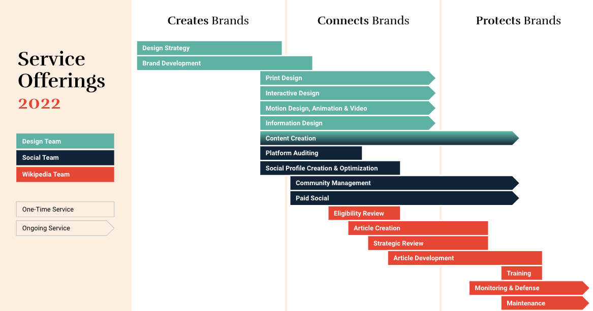
As you can see, the deliverables are plotted across our three key internal teams. They are color-coded, in reference to the internally-based framework we used on the old site, showing how each team contributes to the bigger picture. While each service line and each team is centered on one of the three challenges, there is considerable overlap that we hadn’t fully understood ourselves. This represented a huge leap forward for our self-conception. Whereas before, our verbal identity was focused on the three main things we offered, our new verbal identity was shaping up to focus on the three main challenges we solve for. Now it was possible to start building.
A strategic creative agency
Internally, we began to refer to our response to these challenges as “strategic services”. So, for example, understanding that “brand protection” was the high-level challenge some of our clients needed help with, we translated this into “protects brands” as a service we offer, at a higher taxonomic level than the specific discrete deliverables such as “creating a Google Knowledge Panel”.
This linguistic shift is important. The language you use to talk about your brand should be intentional and specific. If you talk about yourself as a “marketing agency”, for example (as we did for years), you will think of yourself as a marketing agency, and you will act like a marketing agency. But maybe that’s not quite right.
In our case, through the redevelopment of our verbal identity, we realized we are better described as a strategic creative agency. We enjoy and excel at the act of creation more than promotion. Our value is rooted less in building marketing campaigns, or optimizing funnels, but in creating content that helps brands express their values and vision. Sure, the difference might seem subtle. But that small variation at the source has a kind of “butterfly effect” as we go forward making decisions about where to put resources.
It’s critical during a rebrand to make sure you can answer the key questions of who, what, why—not only externally, but inside your organization as well. Buy-in on your central positioning not only ensures consistency of messaging among team members and across platforms, it also helps align your team’s fundamental understanding of what your organization does.
Through our rebranding process, we transitioned from our old positioning statement:
Beutler Ink creates custom marketing solutions that meet core sales and growth objectives. We're the agency (that) leading brands (including more than 30 of the Fortune 500) and hungry upstarts call to tackle their biggest challenges—whether it's breaking through the noise on social media, creating lead-generating content, or finally getting that Wikipedia article updated. And when you work with us, our team becomes an extension of yours.
To our new statement:
Hello! We are Beutler Ink, a strategic creative agency. For more than 10 years, we have helped emerging brands and industry trailblazers tell their stories through engaging content, dynamic social media strategies, and an honest approach to reputation, including our unique embrace of Wikipedia.
Since we are strategic creative agency, it follows that our three organizing concepts would be known as “strategic service offerings”. And that is how we organized the new website.
We now frame what our agency does in terms of these tiers:
Top-level → Positioning statement → (see above)
High-level → Strategic service areas → Create, Connect, Protect
Mid-level → Capabilities → Social Media, Brand Strategy, Content, Wikipedia
Base-level → Deliverables → Building websites, creating social media content, improving Wikipedia articles, etc.
Where we used to have a menu of deliverables split between social media, design, and Wikipedia, with no organizing framework to make sense of our sprawling capabilities, we now have:
Create
We can help you build a lasting brand with a unified look and voice. Get clear on your mission, your goals, and your presentation to the world. Build a rock-solid foundation that will carry your brand into the future.
Connect
Who are you? What do you do? Why does it matter? If your audience can’t answer those questions, you’ve got a problem. Telling your story impactfully and effectively is essential to connecting your brand to your audience.
Protect
Want to protect your brand? You’ve worked hard to build your brand and connect it to your audience. Make sure you have control over your story so you don’t lose what you’ve accomplished.
How does our Verbal Identity connect to our Visual Identity?
With a new organizing principle in hand, our site became much leaner and more manageable. Where before we had created dozens of internal pages as a new idea came to us, now we needed only a handful to convey what we had already brainstormed. Naturally, over time, the number of pages will expand, as we build out additional landing pages, case studies, etc. But firming up our verbal identity provided an armature for the website organization. That is, understanding how we talk about ourselves helped us develop a coherent, intentional sitemap.
This is one of the central benefits of branding or rebranding, and it’s often overlooked. Many organizations approach website building without a plan, adding pages to their sitemap as they think of them. This is kind of like going grocery shopping without a list. Sure, you’ll end up with food in your cart. But chances are you’ll end up paying more than you wanted for a bunch of food that doesn’t necessarily go together. You’re buying food items when you want to be making meals.
A clear verbal identity will give you the ingredients you need for a successful sitemap. You’ll be able to approach your website build with intentionality and purpose.
“A clear verbal identity will give you the ingredients you need for a successful sitemap.”
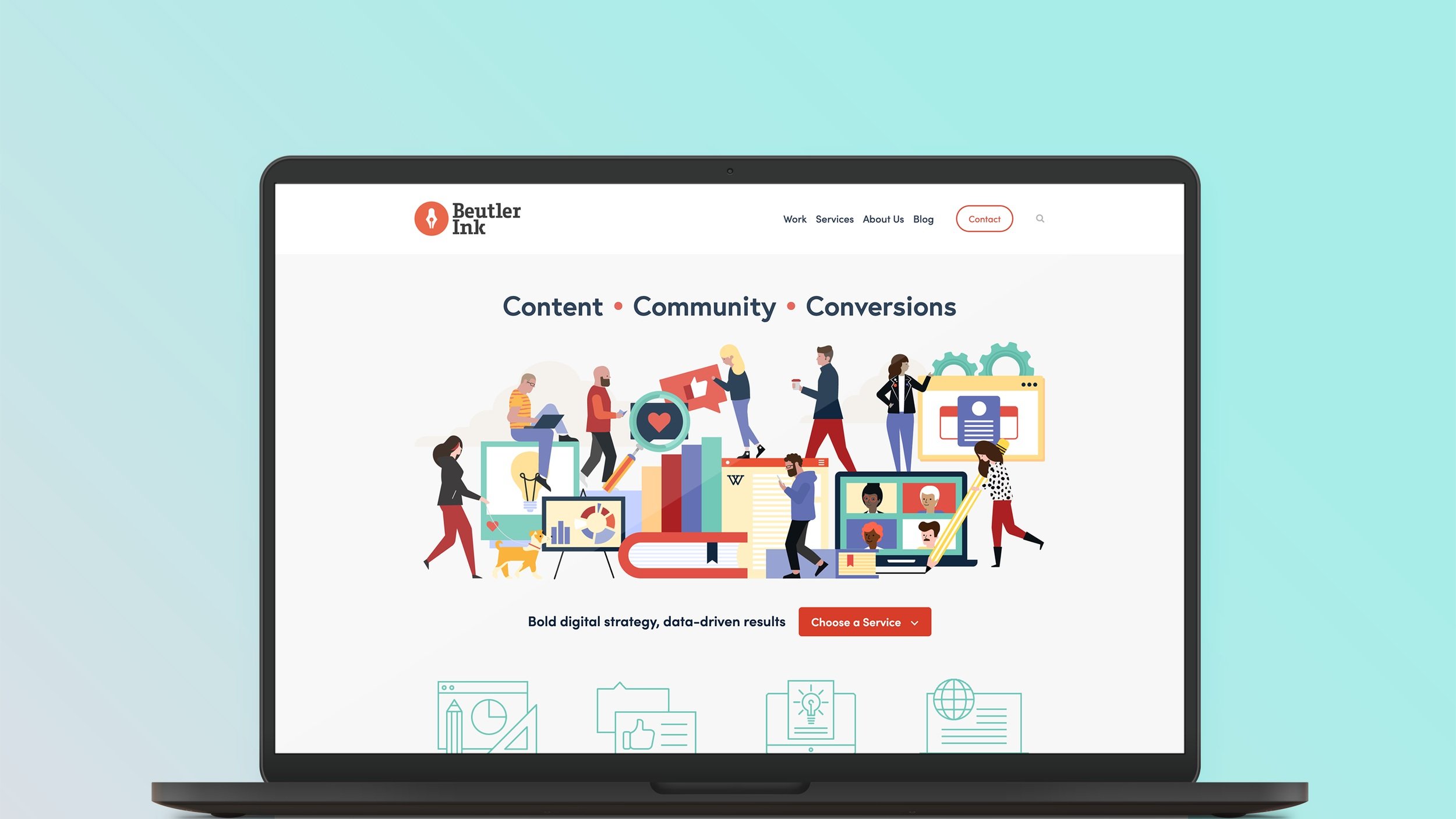
So, how to express our visual identity in a way that would be in conversation with our verbal identity? Stock photos have never cut it for us, and our latest website build was no exception. One thing our design department is especially good at is illustration, and so we decided to lean into that with an all-new series of original illustrations. This also gave us the opportunity to show our personality in virtually any way we chose.
Custom illustration isn’t necessary for a website build, nor for expressing your brand’s verbal identity. However, eye-catching original design is one of the most powerful ways you can share your story with your audience. Just as the specific, intentional choices you make in your written communication will shape perception of your brand, the design choices you make will inform the relationship between your brand and your audience.
The first thing we did was think about what we wanted to communicate visually, before worrying about how. We decided we wanted to showcase our award-winning illustration by telling a tiered story:
Top-level → Overall presentation
High-level → Strategic service offerings → Info-dense imagery
Mid-level → Capabilities → Hero images
Base-level → Deliverables → Elevated icons
As you may have noticed, this parallels the framing of our verbal identity.
The evolution of our visual identity
Any successful branding strategy will have a distinct, clear point of view. In visual identity, this is often expressed in an organization’s logo. In our case, our logo wasn’t changing; we are still happy with it, and the brand equity we’ve built up over the last decade is invaluable.
Instead, we chose to use illustration to express our point of view, with the header image on our home page being the top-level tier of our strategy and tantamount to a visual positioning statement:

It encompasses and communicates who we are and what we do, and it’s downright beautiful to boot. The colors are bold, while the composition invites further investigation. Just like a written positioning statement, pieces of this illustration are echoed across the website.
To align the story we’re telling with our copywriting, we made sure that our design process had the same storytelling goal. We workshopped how best to represent the elements of each strategic service offering, the next tier in our visual identity:


The three illustrations clearly share a language, but each stands on its own. By changing the color palette for each image, we were able to emphasize that each strategic service offering is unique, but still a part of a cohesive whole. They also mirror the color scheme in the hero image, further reinforcing our visual messaging.
Custom illustration is unquestionably more time- and cost-intensive than stock photography or simple iconography. As a strategic creative firm, though, using illustration to express our visual identity was always going to be part of our rebranding strategy.
The next tier in that strategy was our capabilities. On our previous site, the visual component of those pages fit the overall approach: Sparse, and to the point. Take this header illustration from our old Social Media page, for instance:

Compare that to our rebrand approach: the illustration is a snapshot from the hero image on the home page. It’s robust, full, and vibrant, connecting directly to the visual identity we established on top of our home page.

For our specific deliverables, we knew we wanted to evolve the icon-heavy design style that has become ubiquitous in web design; at the same time we are web designers who understand the user-experience impact of good iconography.
Ultimately we developed what I like to call “elevated icons”; a hybrid of icon and illustration that serves the same wayfinding purpose of traditional icons while providing more intense, personalized visual interest.
Just look at these beautiful examples:


Conclusion
Ultimately, our website rebrand took several months and hundreds of agency-hours. So, was it all worth it?
We certainly think so.
By committing to a rebrand, we were able to:
Distill our positioning
Clarify our messaging
Unify our verbal identity
Enhance and update our graphic style
Align our verbal and visual identities
Streamline the organization of our website
Improve the user experience of our website
Rethink and strengthen our value proposition as an agency
It was a lot of work, but it’s invigorating, positioning us for growth. Put another way: we found our story and told it.
In fact, our strategy was so successful we were recognized with a Davey Award for Website Redesign!
Thinking about rebranding, but don’t know where to start? Interested in learning about your options? Let’s chat—no strings attached.
