
Data Viz 101: Clearing the Bar Chart
Welcome back to Data Viz 101, Beutler Ink’s introductory seminar on the wonderful world of data visualization.
In our last installment, we looked at the pie chart, which can effectively be used to show percentages or part-to-whole relationships. Today, we'll talk about bar charts, one of the most commonly used types of data visualizations because they are so easy to create and interpret.
As you probably already know, bar charts use rectangular columns—the bars—that are proportional in length to the values they represent. The longer the bar, the bigger the number. Bar graphs are extremely effective at (a) comparing different categories of data measured along the same scale, or (b) tracking changes in the same category of data over time. Bar charts are usually presented vertically, but they work just as well when stretched horizontally.

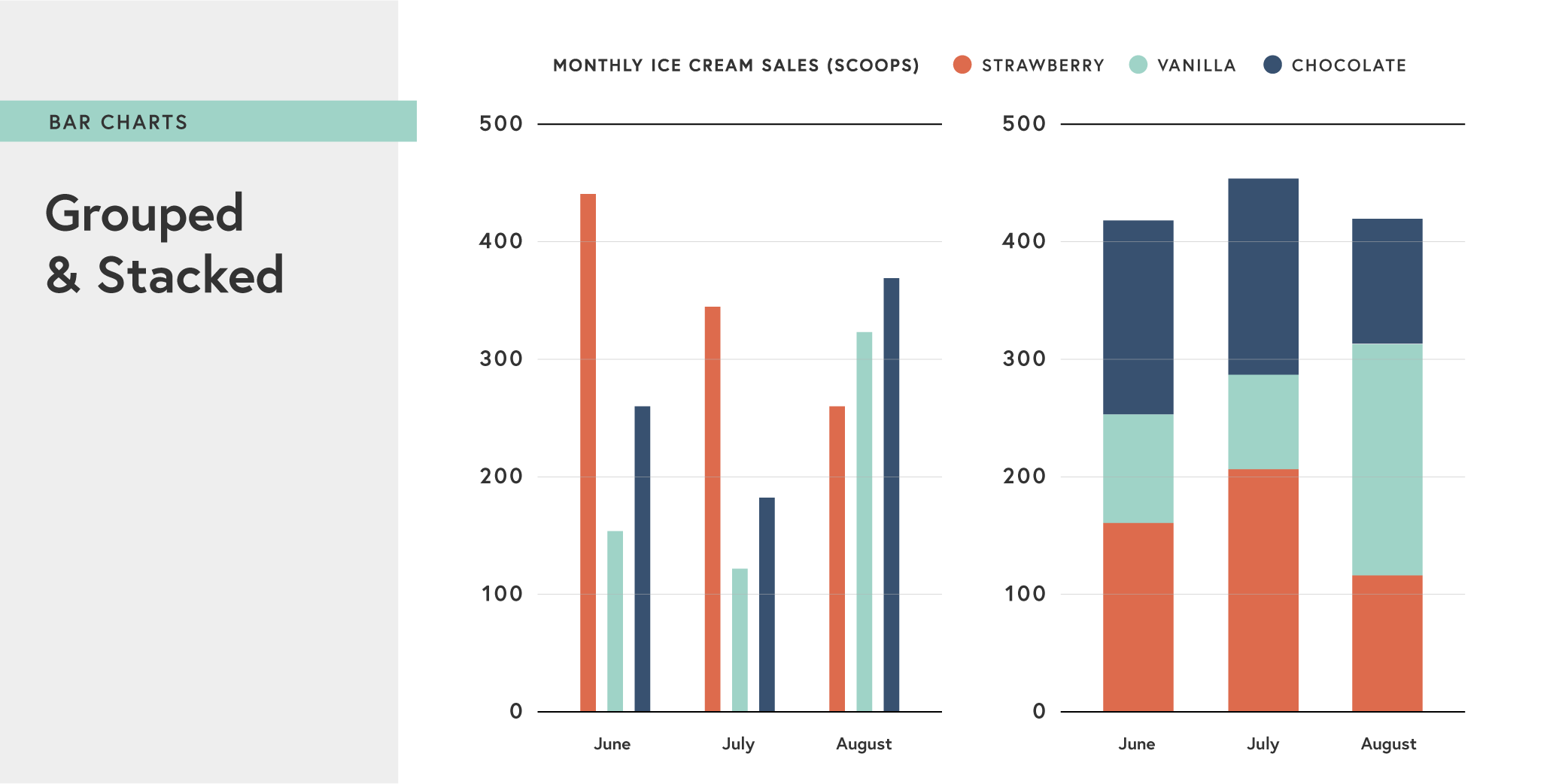
Grouped bar charts can be used to represent and compare different categories of two or more groups.
Stacked bar charts allow you to showcase and compare part-to-whole relationships. But the same caveats about pie charts apply—make sure each bar represents 100% of the data. This is crucial because a stacked bar chart relies on the WHOLE as the reference.

Distorting the truth
Another bar chart no-no is inconsistent depiction of scale. For example:
In this chart, six medals equals 1,975 medals, while 5 equals 999 medals, and 4 equals 615. This doesn't make any sense. Clearly the newspaper editor decided they wanted some graphical representation, but didn't have the space do it right, and the designer apparently just didn't care. Without a consistent scale, there may as well not be any visualization. All this tells us is that 1,975 is a bigger number than 999. And so this graphic is misleading in its depiction of the relation the data points to one another—that is, it appears that 615 is as close to 999 as 999 is to 1,975.
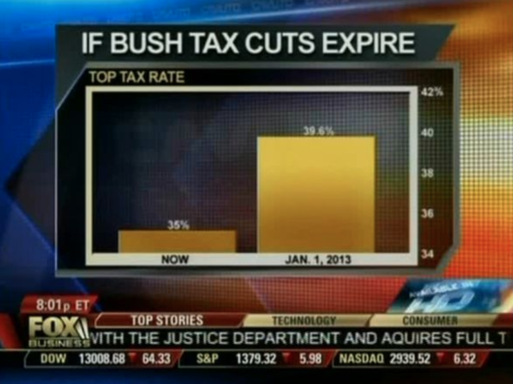
Here's a more extreme and very likely intentional example of distorting scales of data:
Cable news watchers will probably remember the time Fox News exaggerated the change in the top tax rate if the Bush tax cuts expired by truncating the y-axis. As a general bar chart rule, the numerical axis (often the y axis) should always start at zero. Here’s how that chart should look. Clearly, the change is much less pronounced when you look at the big picture.
Exceptions to "always start a zero" rule can be made if a low range of y-axis data points is effectively not possible and thus not relevant to the viewer. For example, if a visualization of stock market activity started the y-axis at zero, the visualization would look like a flat line no matter the fluctuations.
Include all of the data
Another bar chart best practice: Include all relevant data points, even if that makes a "trend" look less significant. In this example, the increase from April to May looks pretty impressive, but it’s much less significant once you show the preceding months.
It short, bar graphs are a great type of data visualization because they're easy to understand at a glance (in part due to widespread use in business and the media), and able to show changes over time (unlike a pie chart). Bar charts can be easily manipulated to yield false impressions, though, so it's important that all relevant data points are included and that important context is always included in the presentation of the graph.
