
Data Viz 101: Everything you need to know about line graphs
Hello friends, and welcome back to Data Viz 101, Beutler Ink's introductory seminar on the wonderful world of data visualization.
In our last post, we continued with our deep dive on data viz history by looking at the work of Florence Nightingale and John Snow, who both used data visualizations to address health crises (poor medical care for troops in Crimea and cholera outbreaks in London, respectively). Their work underscores the real value of presenting data visually—to help viewers see trends, gather insights, and understand complex stories.
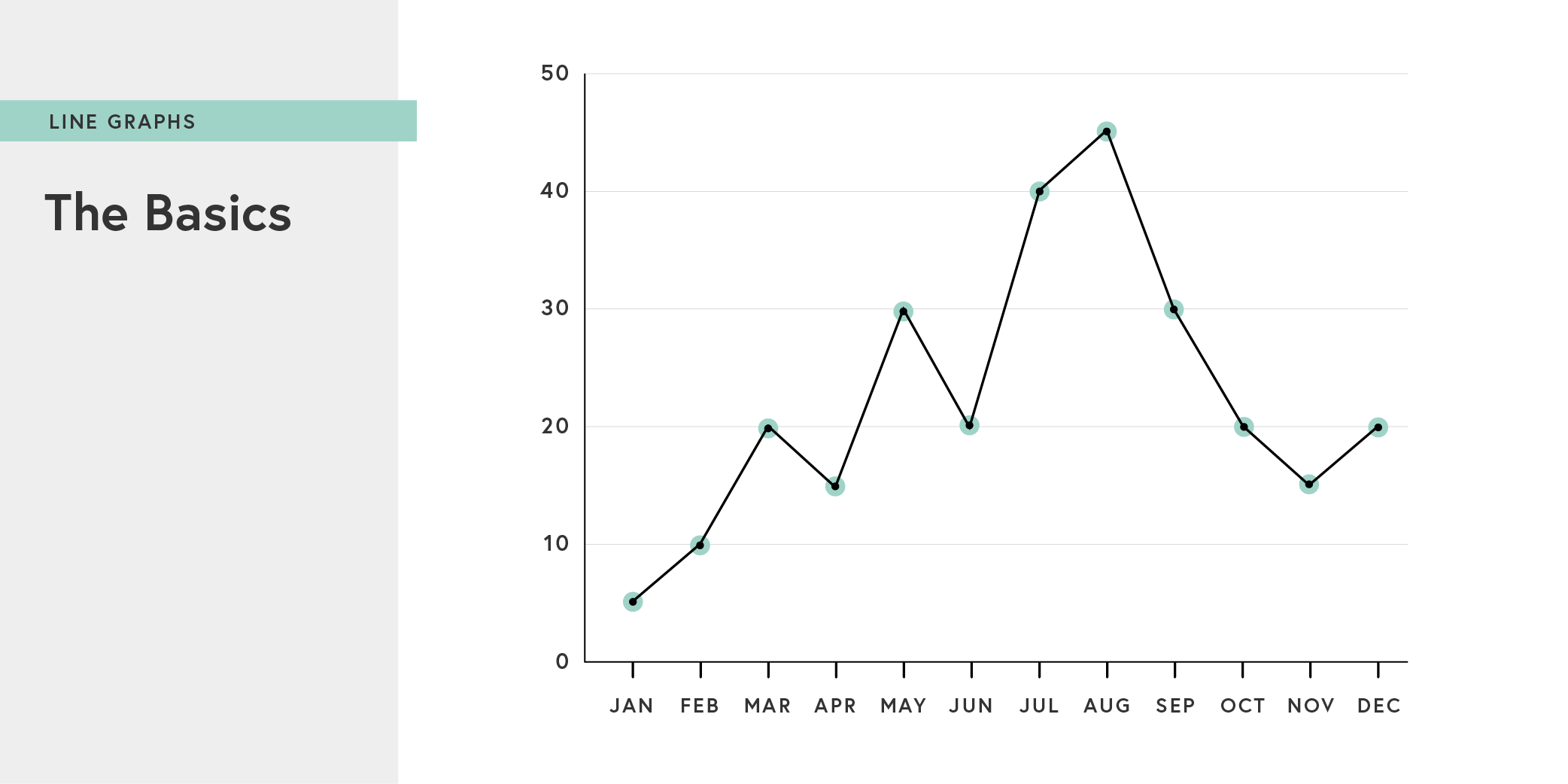
You don't need fancy 3D models or interactive microsites to convey this information—you can use something as simple as line graph. A line graph (or line chart) is a form of data visualization in which data points are aligned along an X-Y axis, and then connected by straight line segments. Line charts are one of the oldest forms of data visualization, as our previous post about William Playfair makes clear.
Line graphs are especially effective at tracking changes over time by using the Y axis to represent intervals of time (often days, months, or years). Line graphs can be used to track multiple data sets on the same chart to see any correlations. So whether you’re tracking increasing national debt levels (as Playfair did) or the important internet trends (like you'd see in one of Mary Meeker's slide decks), simple line graphs prove an accurate and easy-to-follow depiction of data.
Best practices
Even the most basic versions of line graphs (like the ones Excel can generate for you) are generally effective, but there are some considerations to keep in mind when you're setting the data parameters.
First, context is always critical. Include all relevant data points, even if that makes a "trend" look less significant.
Second, you should generally try to show the zero baseline of the y-axis. Without it, your data isn’t grounded, and your visual language will depict something different than the data itself.
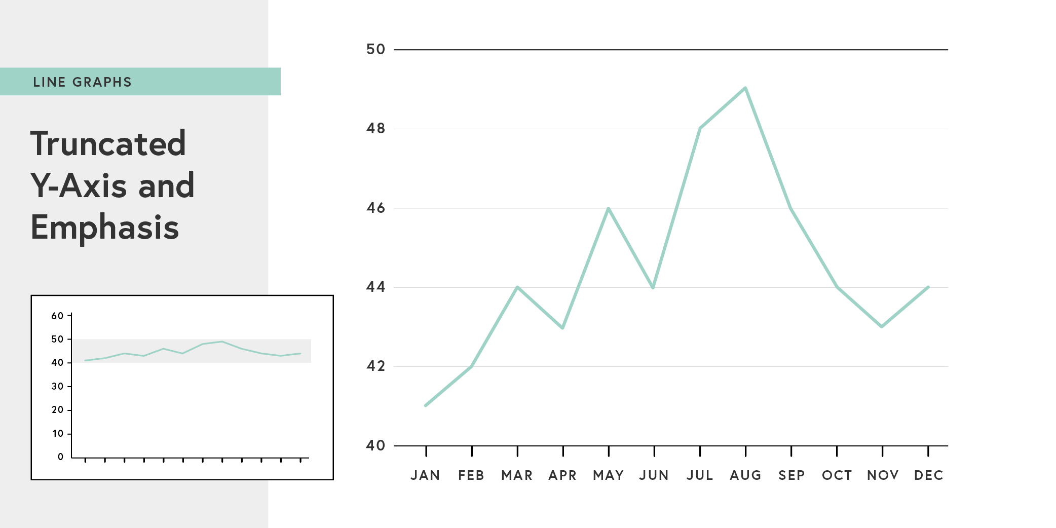
Due to space limitations, however, you might want to zoom in to highlight changes that are significant to the dataset, even if they don’t appear pronounced. In that case, you can highlight variation—while still showing zero baseline—by using an inset with the full data range.
Data Labeling
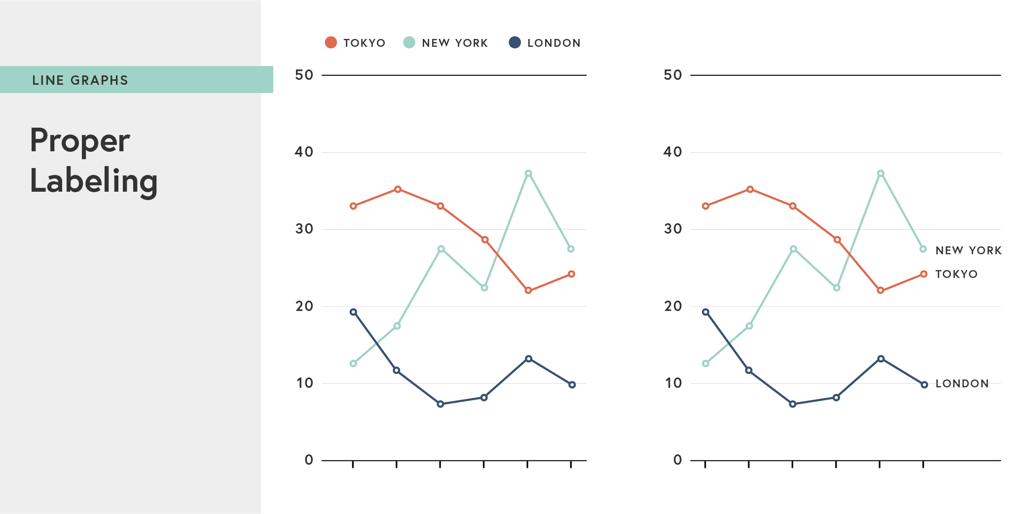
Finally, data labeling is very important with line charts, as the lines will often intersect and overlap. Here, the data categories are easy to decipher when the labels are attached to the lines, rather than depicted using a key on the bottom.
Remember, the only goal of data visualization is to clearly present accurate information. Or at least it should be. Be mindful of design choices that might, even unintentionally, obscure this goal.