36 Days of Type
36 Days of Type is an annual open call for artists and designers to design a creative interpretation of each letter of the Latin alphabet (plus standard Arabic numbers) for each day of the challenge. It was started in 2014 by two graphic designers from Barcelona, and in the years since it has attracted a considerable following, now with more than 1.2 million entries.
The entire project lives on Instagram, where artists post their always-creative letterforms, following the schedule laid out by 36 Days of Type, using the project’s hashtags to join in. While some creatives design a new letter/number for each day of the challenge, it's not required; folks can opt in to as many or as few days as they’d like.
The prize? No monetary reward, just potential exposure and bragging rights: each day of the challenge, the organizers of 36 Days of Type choose a curated selection of the submitted designs to feature on the official 36 Days of Type account, which has over 340,000 followers.
The real prize of 36 Days of Type, though, is the thrill of absolute creative freedom. The project invites artists and designers all over the world to explore, experiment, and play with no creative confines—and the results are inspiring. Scrolling through the vast pile of entries, you see how the same symbols can be represented in thousands of different ways. Established designers and novices alike submit incredible work, and the sheer variety of perspectives on display is dizzying.
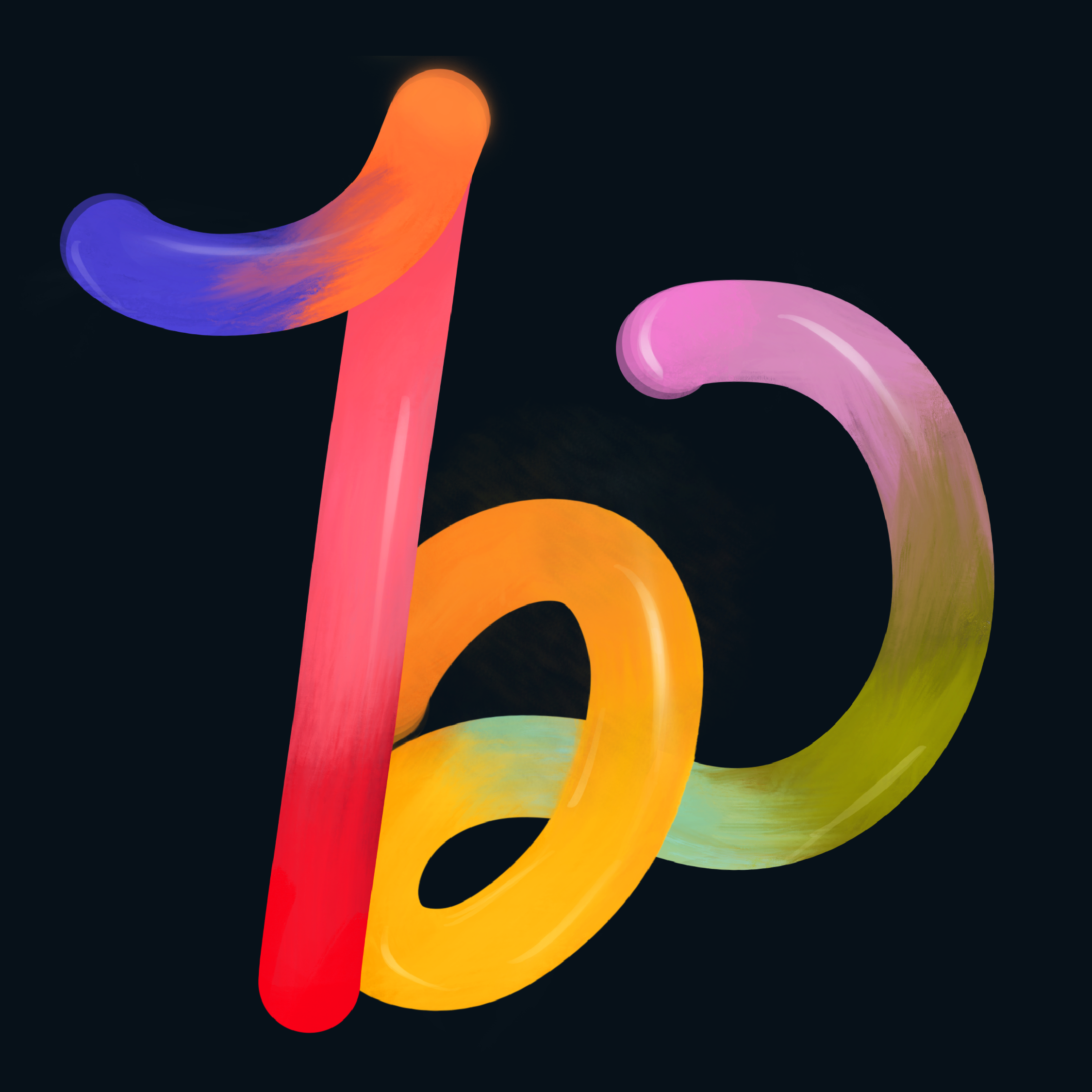
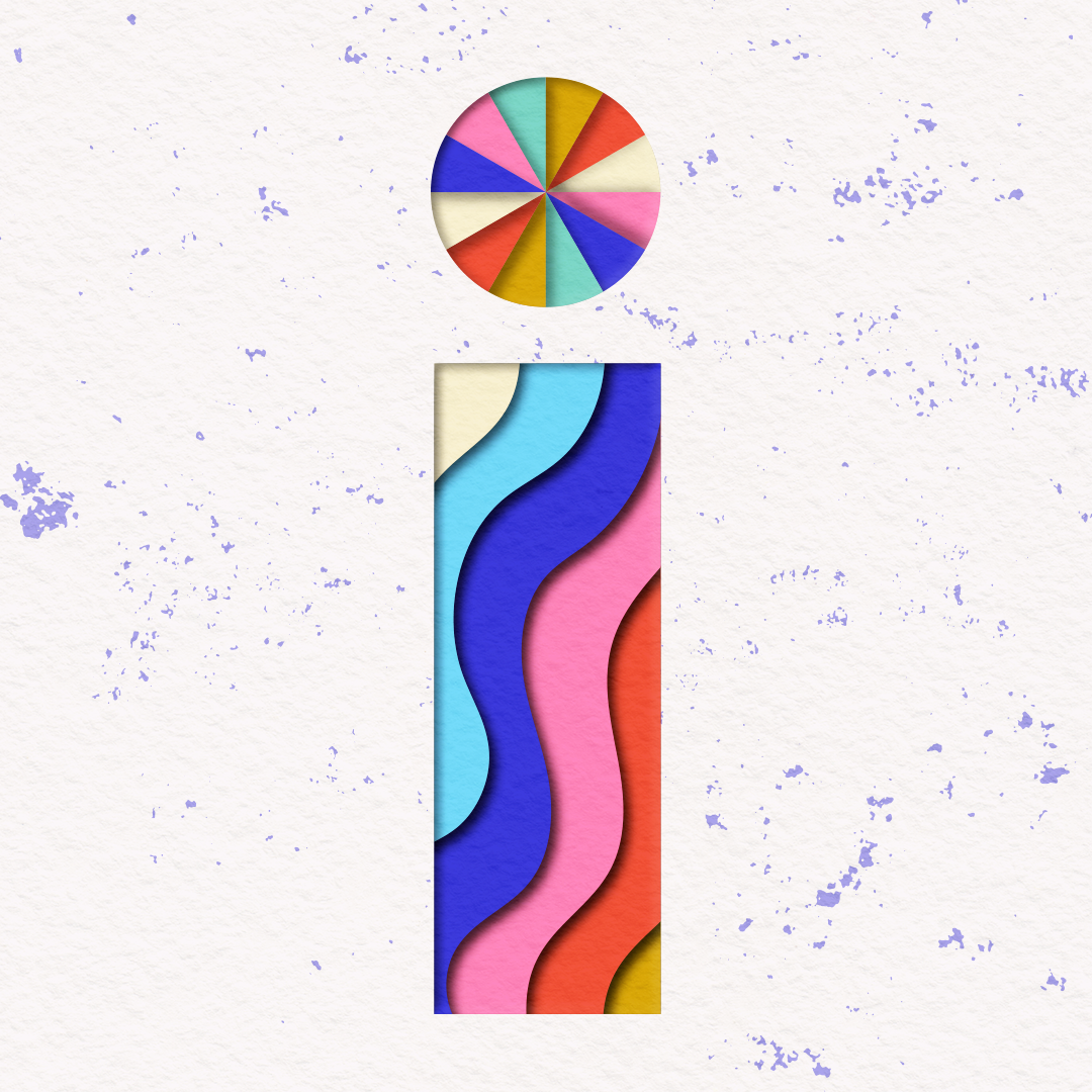
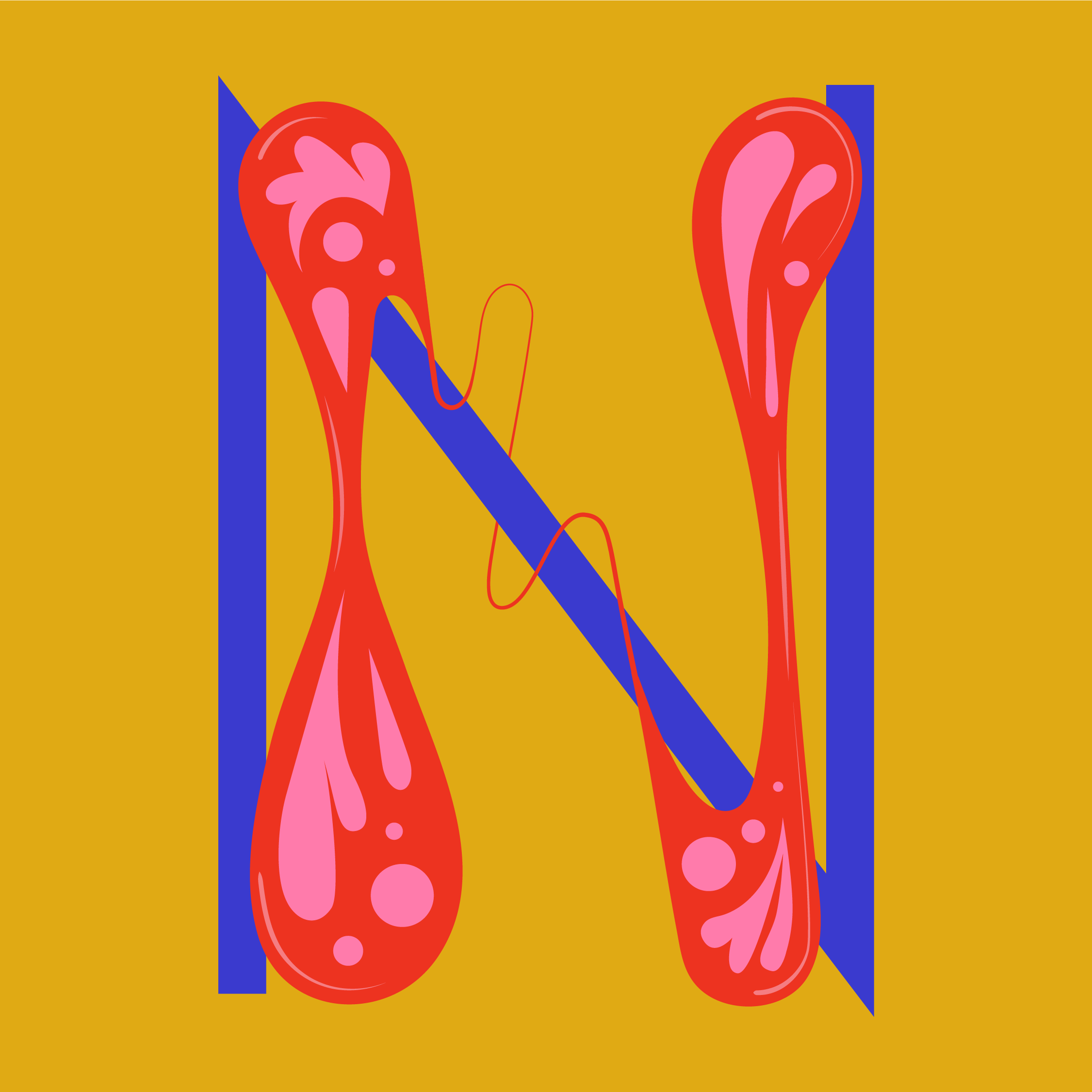
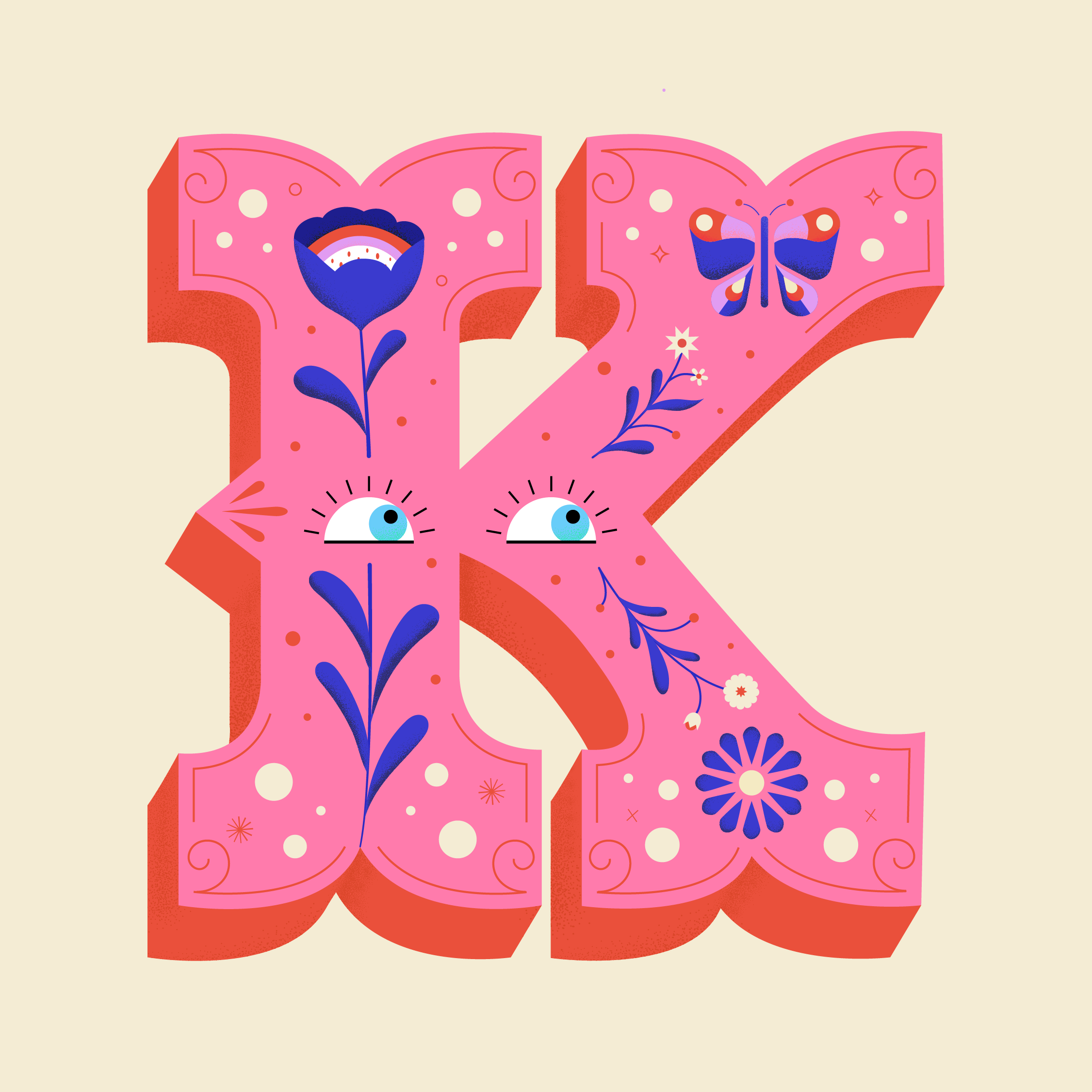
How many ways are there to represent the letter ‘B’? You. Wouldn't. Believe. As lovers of typography, participating in a challenge that encourages artists to “explore the creative boundaries of letterforms” was exciting and something we wanted to be a part of. We decided to enter the challenge, designing the letters for our agency nickname, “BINK”.
Our Process
The process for creating our “BINK” letterforms started with rough sketches. We challenged ourselves to think of interesting ways to represent each letter, and along the way asked ourselves what personality we wanted each one to have. You may be surprised at how subtle differences in a letter’s shape can change their personality! Letters composed of geometrical shapes tend to be perceived as friendlier, for example (think of typefaces such as Futura or Brandon Grotesque), so a perfectly round circle as the bowl of an “a” will read more approachable than an oblong one. A higher degree of contrast between thin and thick in a letter can read as “posh”.
Of the sketches, we gravitated to the letters that didn’t take themselves too seriously; those which were whimsical and friendly, whose forms left plenty of room for having fun with color, depth, and texture. We took care to make the letters loosely related, but uniquely their own. We reminded ourselves that this was our opportunity to play.
Here at Beutler Ink, we love executing complex design projects and we love the clients we work with. Even so, sometimes we need to stretch our imaginations and create something not bound by brand guidelines, client expectations, stakeholders, or “mandatories” to focus on a more open-ended challenge. Exercising creative muscles outside of projects with strict rules helps stave off creative block and keeps our brains loose and open so we can make better work for our clients in the day-to-day.
Definitely check out 36 Days of Type’s Instagram feed for a curated collection of inspiring letters. You can also explore the #36daysoftype hashtag to see all of the entries. We’ve had a blast seeing how other artists and designers approached this challenge and we’re grateful for the community that 36 Days of Type has created.