
Can You Guess These Logos By Their Decontextualized Elements?
If you've never seen LOGORAMA, a 2009 animated short film about a world made entirely of brand logos, I can't recommend it enough. (Watch it on Vimeo here). Here's the Republican elephant at as a zoo animal, there's Bob's Big Boy as an ornery brat. The last time I watched, I realized the USB symbol had been turned green and repurposed as a shrub. It's all predicated on common logo recognition, and it's something we do every day, whether we want to or not.
But when we see logos, do we actually look? Not long ago, I was doing what I do most days and am doing right now: sitting in my office, staring at a large computer monitor. This monitor is almost always showing me logos: on a web page, in a favicon, or the Mac OS menu bar. But this time, I looked at one, and it occurred to me that some of the free-floating elements within them look really bizarre—even potentially unrecognizable—if removed from their context.
Pictured immediately below is the precise element of the specific logo I was looking at. Do you recognize it? Try to guess, and hit one of the arrows when ready. More below the image.
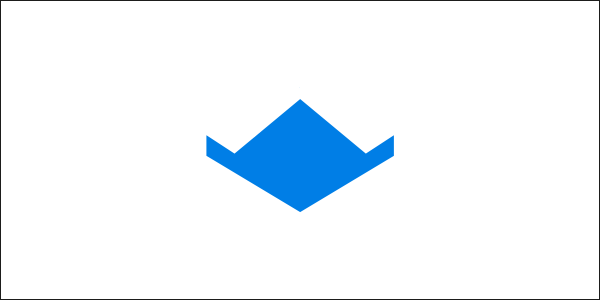
Of course! Right? It's the service I use to share pretty much everything with pretty much everyone. The floating image is the bottom of the box, and the W-shaped top edge is where the flat design required a cutaway for the closing flaps. It's worth noting that the old version did not have the same gap (and perhaps also that Under Consideration disliked them both).
Curious about this effect, I decided to go looking for other examples of funny shapes within major company logos to see what others I could find. The rest of this post presents my best findings for your puzzlement-and-realization enjoyment, with just a bit of commentary.
I promise they won't be unfair—I'm not giving you the red circle in the Target bullseye. But nor am I giving you the old Pizza Hut roof, because that's too easy (and forget the new one). Also, there will be no FedEx logo. The famous hidden arrow, being white, wouldn't display very well, and besides that's totally old hat by now. Anyway, if you think this is fun and can think of any others, hit "share" at the bottom of the post and we'll look to see your own examples!
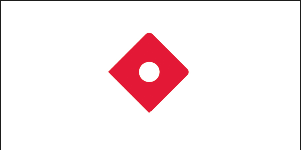
Did you guess that one? This seemed to me one of the potentially most obvious—but in playing this "guess the logo" game with others, I've found it stumps most people.
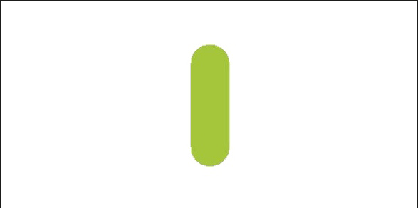
This one is probably the gimme. The rounded corners at the top and right give away that the opposite edge is incomplete, and if you've ever been a sleep-deprived college student (or irresponsible adult) then this logo is one you've shared many a 2am with.
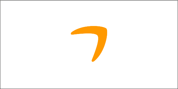
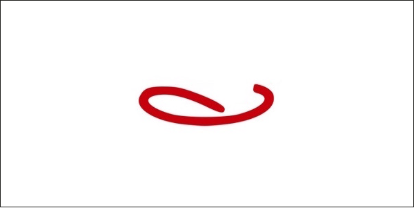
Surprisingly difficult! Unless of course you got it immediately.
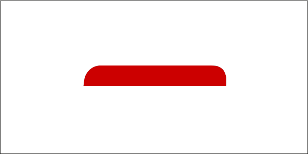
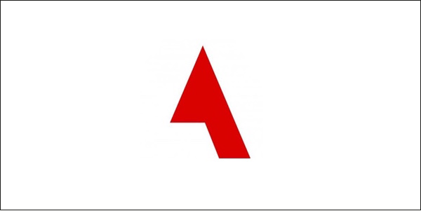
The worldwide leader in deceptively simple geometric elements.
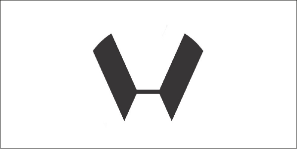
This one is probably my favorite, given the complexity of the logo, the fact that negative space is usually white and not black, and the unusual, almost Wu-Tang bat-like shape that emerges below the V and above the W.
Designers tend to get this one most readily.
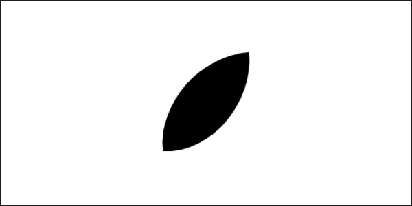
iPhone owners tend to get this one least readily.
More than once, this was guessed as the Apple logo. Not so! But one can imagine why.
I kid you not, someone guessed "Titanic". And now, like the aforementioned FedEx arrow, this is something I can never unsee.
Yeah, I had to end on this one. What can I say, I must be a nihilist.
— William Beutler