
A look at the new Facebook Pages
Have you noticed Facebook’s business pages looking a little different lately? Don’t adjust your monitor, turns out the social media giant is testing a new design amongst a few of its users. The biggest change is to the cover photo, which is now unobstructed by a page's profile photo, username, and call-to-action buttons. These elements have been moved to the side and profile pictures have been bumped down to 160x160.
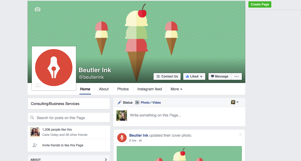
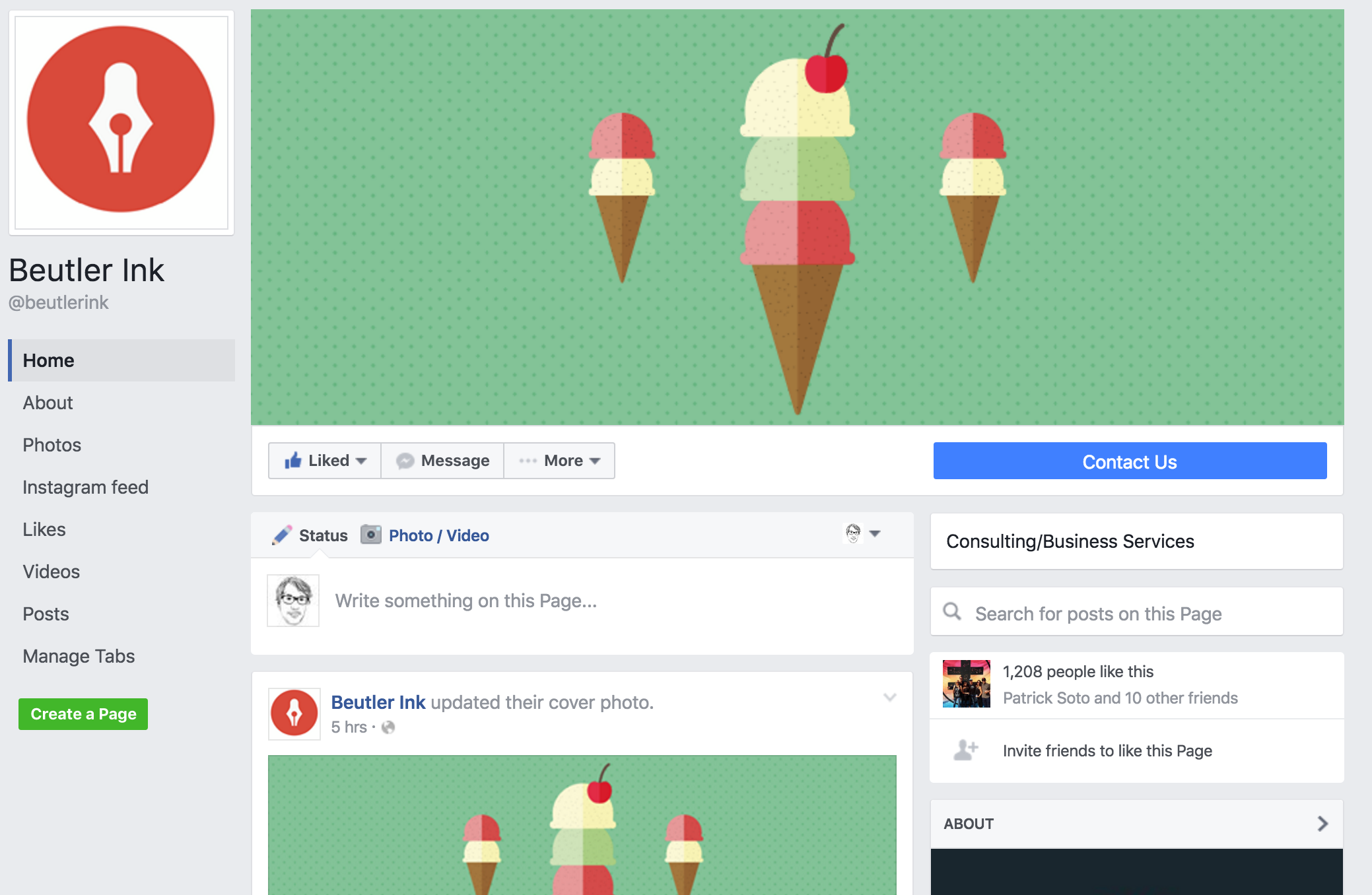
Messenger gets a prominent button next to the ubiquitous “like”, and tabs have moved to a stationary bar on the left, ensuring that no matter how far down someone scrolls they can easily access your most important information. Cards remain unchanged.

Unfortunately the mobile experience also remains unchanged. It still features a cover photo that’s slightly taller than the one on desktop. This makes it difficult to create an image that doesn’t look distorted on at least one device. Luckily, we’ve taken away the guesswork and designed a tool that ensures your brand always puts its best foot forward.
Facebook seems to be staying mum on the changes, so we wouldn’t be surprised if there are a few tweaks before the official announcement and rollout, but it’s a good time to revisit the design of your brand’s page. At this point the upload dimensions are the same, so take a look at our social cheat sheet to make sure you’re ready for the update!