


Football vs. Football: World Cup Viewers vs. Super Bowl Viewers (2022 Update)
Which has more viewers, the Superbowl or the World Cup?

Football vs. Football: World Cup Viewers and Super Bowl Viewers
As big of a spectacle as the Superbowl has become, it still pales in comparison to the World Cup.
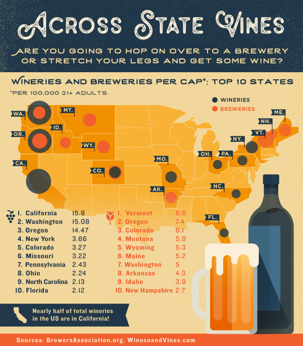
Thursdata: Across State Vines
Infographic covering the top ten states by wineries and breweries per capita.

Six Ways From Sundae
Ever wondered just what goes into ice cream? Think it's cream, sugar, and eggs? Think again!

4 Data Visualizations to Check Out from May
Can you believe it's already June? That means it's time for beaches, barbecues, and of course our look back at Thursdata in May!
5 Data Visualizations You need to check out
Thursdata is turning 5...weeks old! And to celebrate this momentous occasion, we thought we’d take a look back at the great data viz we’ve shared so far.

Introducing the Growthverse: How to find the right marketing tools for your team
Beutler Ink worked with Accel Partners to develop an interactive infographic depicting the marketing technology universe.
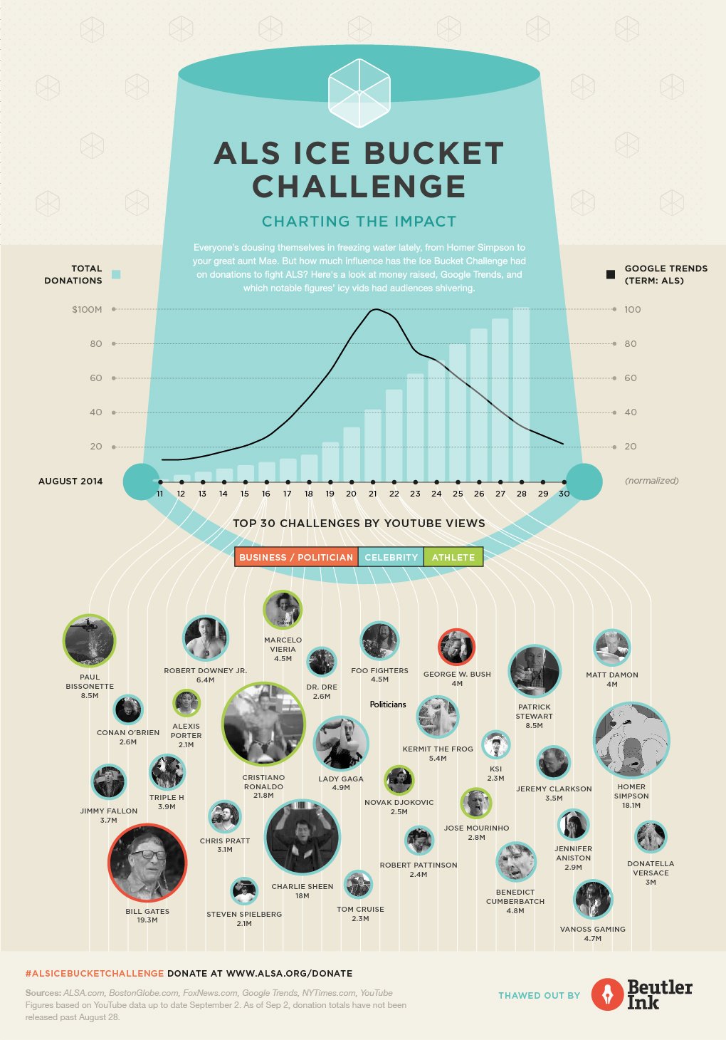
Infographic: Charting the #ALSIceBucketChallenge Internet Sensation
Our infographic charts the impact of this internet sensation from search trends and donations to the iciest celebrity videos according to YouTube views.

Football vs. Football — World Cup Viewers and Super Bowl Viewers
If you had any doubt about the popularity of soccer in the rest of the world, let those doubts be dashed.

Where can I read more about data visualization?
Writing about data visualization is like dancing about your PhD thesis. When improperly executed, the jeté between explanatory and interpretative mediums can be jarring.

What can't you visualize? (Hint: nothing)
How do I quantify just how much better French vanilla ice cream is than all of the other flavors? You can't make a chart of that, can you?
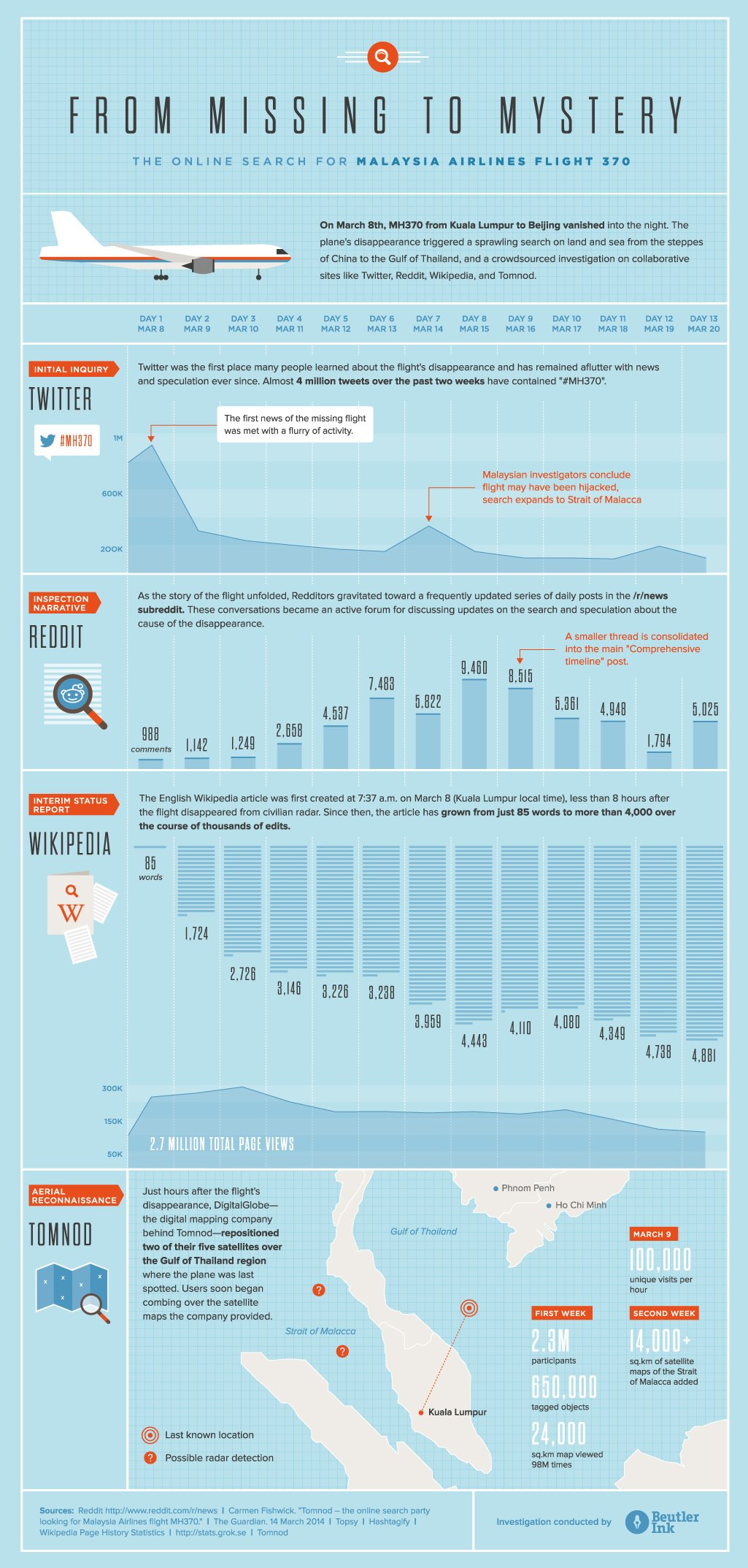
Into Thin Air: The Internet responds to Malaysia Air flight 370
We take a look at how people on the Internet have responded to the disjointed and constantly evolving narrative of the missing aircraft.