

Good Intentions, Bad Translations
Well-meaning translators run into a volunteer buzzsaw, the Wikimedia Foundation wants to keep up with its readers, and a Swedish pop singer takes up arms against Wikipedia.
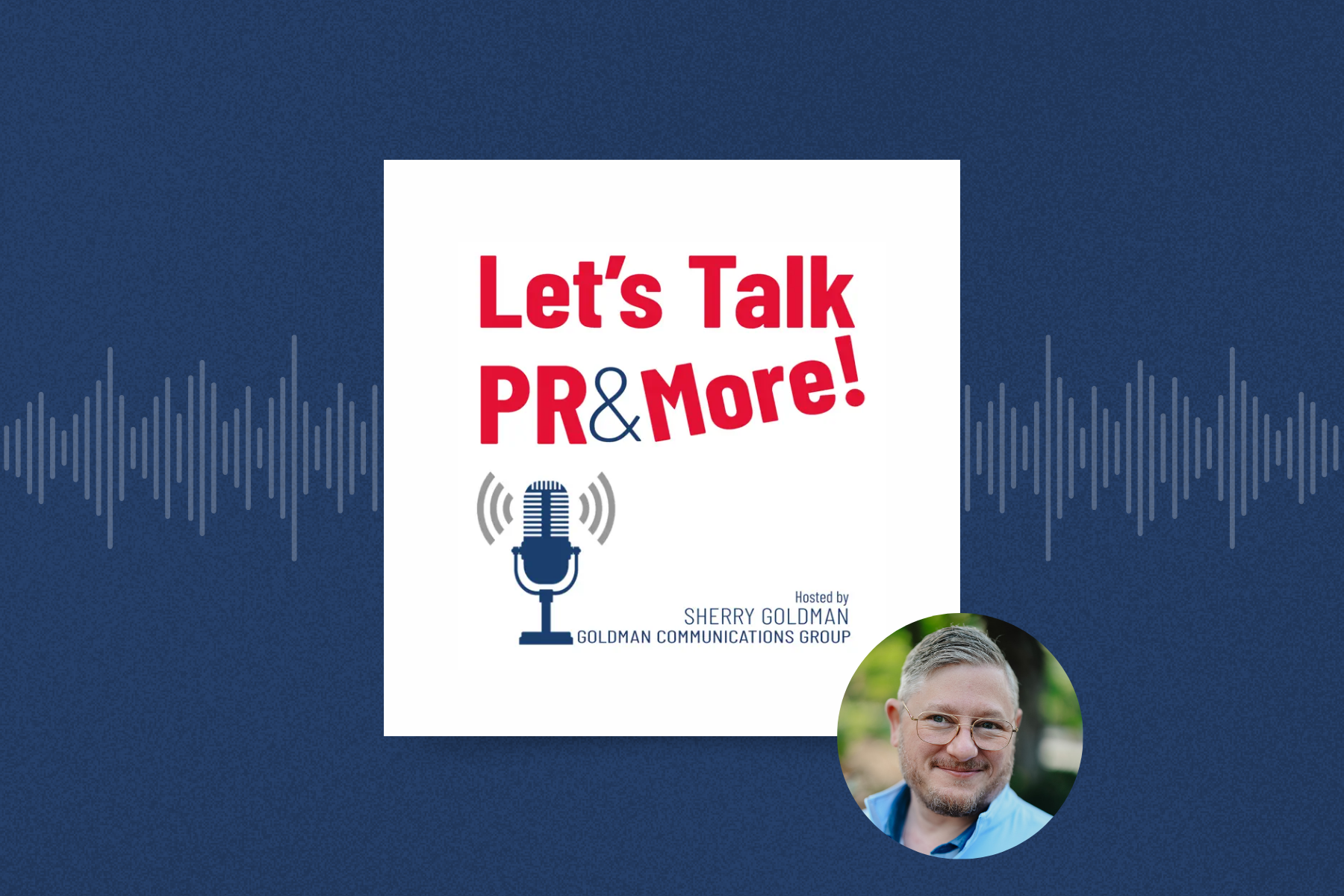
Let's Talk PR & More Show | Bill Beutler on Wikipedia
In the latest episode of Let's Talk PR & More, Bill Beutler joins Sherry Goldman to discuss Wikipedia's growing role as a key information source for AI. They cover how Wikipedia works, the ethics of contributing information, and why AI systems rely on it.
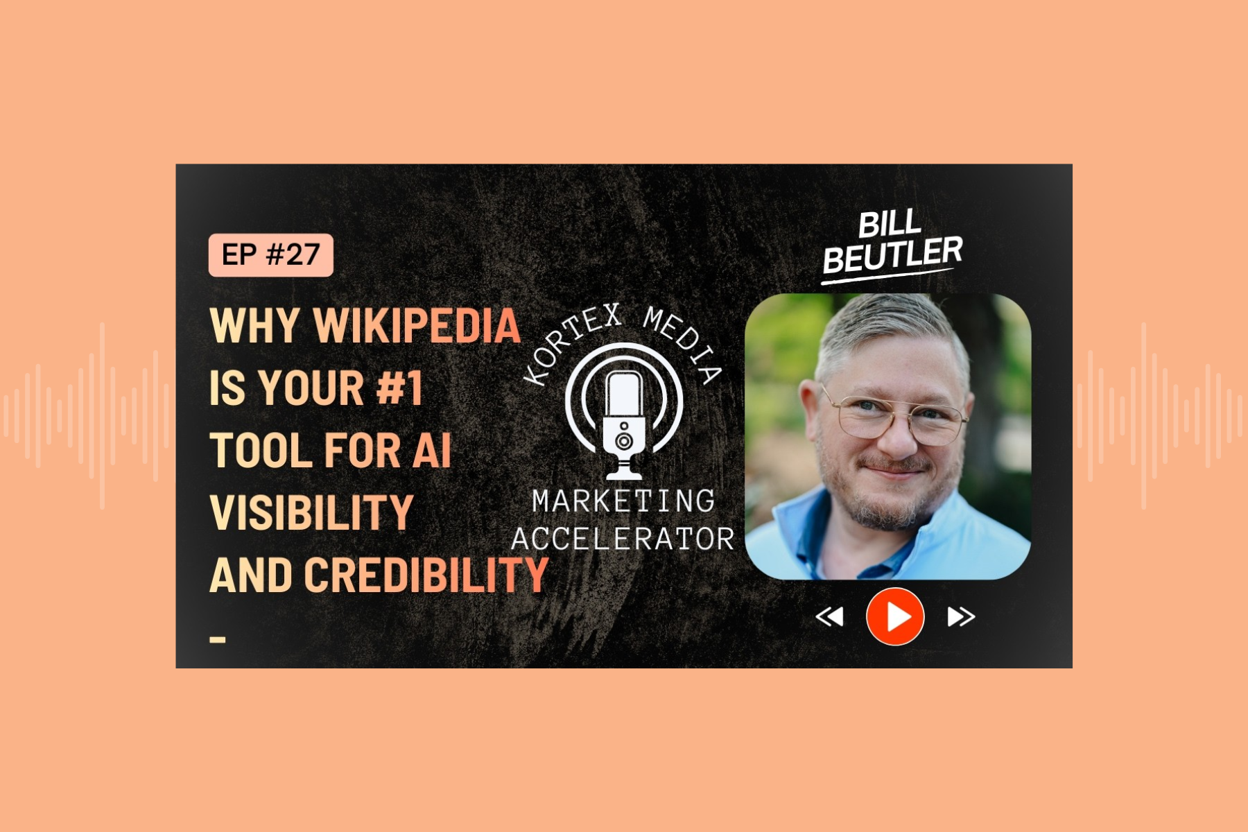
Kortex Media | Why Wikipedia is Your #1 Tool for AI Visibility and Credibility
In this episode of The Kortex Media Podcast, Bill Beutler joins host Korson Schmidt to discuss pioneering ethical Wikipedia strategies and the evolving landscape of digital notability.
Is time running out for Wikipedia?
Former Wikimedia trustees are sounding the alarm: Wikipedia must adapt to AI or risk irrelevance. Read more in this edition of WikiWise.
How to Spot AI Writing, According to Wikipedia
Distilling the wisdom of WikiProject AI Cleanup into a breezy listicle of the strongest indicators what you're reading was ghostwritten by an LLM.

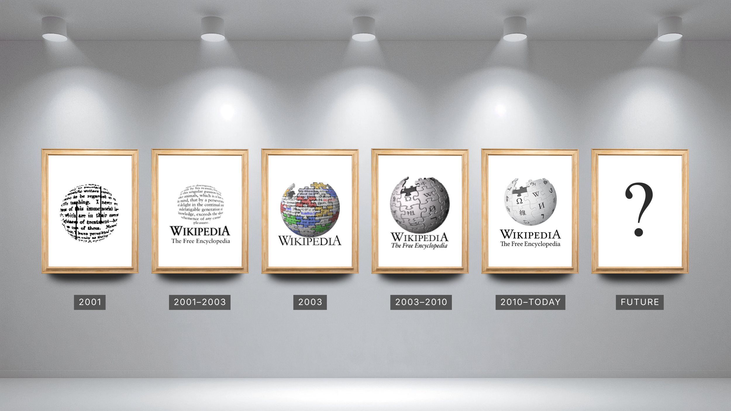
Wikipedia is old enough to rent a car
AI companies are ponying up on Wikipedia's 25th birthday, but no one knows what's in store for the next quarter-century of free knowledge.
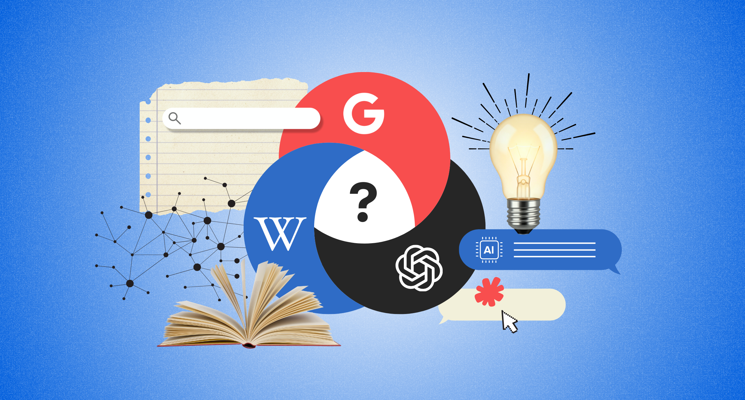
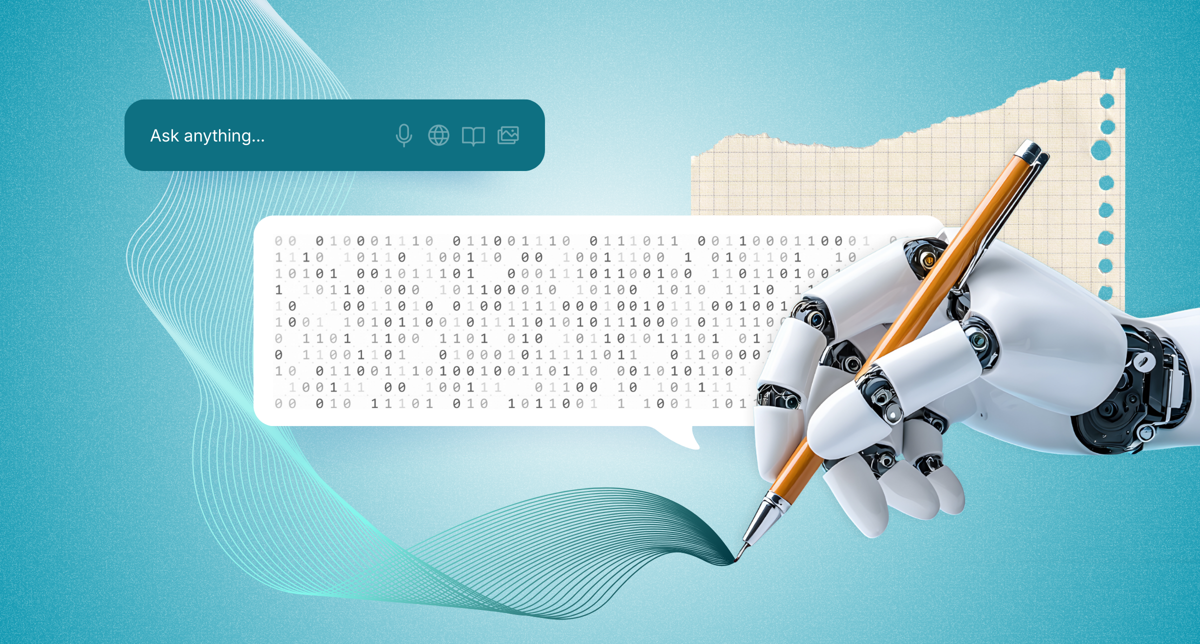
When to Use Google vs. Wikipedia vs. ChatGPT
Google has long dominated online search, but for nearly that entire length of time, Wikipedia has served as both a key information source and reliable alternative throughout that reign.
Artifical Insights | Who Decides What AI Knows? Wikipedia, Sources, and Trust
In this episode of the Artifical Insights podcast, Bill Beutler discusses why Wikipedia has become an essential resource for modern AI, and how its rules, sourcing standards, and volunteer model shape what machines (and people) trust as fact.

Hail to the new chief (executive)
The Wikimedia Foundation gets a new leader just as it gets ready to celebrate Wikipedia's 25th birthday. Meanwhile, AI legal battles are poised to change how Wikipedia works.

Changelog | The Inner Workings of Wikipedia
In this episode of the Changelog podcast, Bill Beutler joins hosts Adam Stacoviak and Jerod Santo for a deep dive into the world of Wikipedia. They explore the site’s official (and not so official) rules, what makes an edit survive or disappear, and how AI tools may help or threaten the platform.

My Way or The AI Way | How Wikipedia Works And Why It Still Matters
Bill Beutler sits down with the My Way or the AI Way podcast to unpack how Wikipedia actually works, how it influences AI models, and what business owners and individuals should know if they want to build a legitimate presence on the platform.
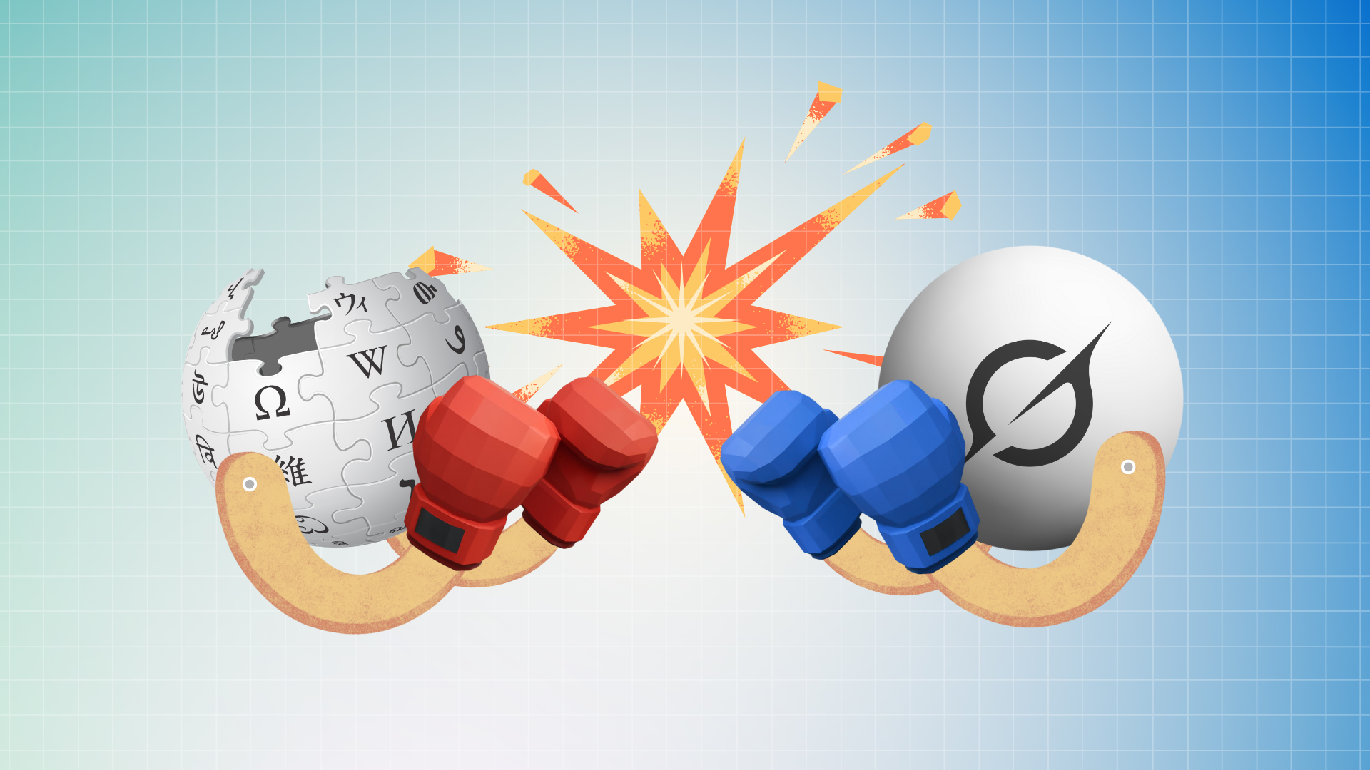
Hickory dickory Grok, AI on the block
Wikipedia has never been the favorite website of American conservatives, but a new initiative from the Heritage Foundation seeking to "identify and target" editors is a concerning development.

Fuse | Wikipedia’s Crucial Role in the Digital Age
Drawing on Beutler Ink’s expertise in helping organizations manage credibility and information online, Bill discusses the complex relationship between PR and open-source platforms, and the critical role Wikipedia plays in the age of artificial intelligence.
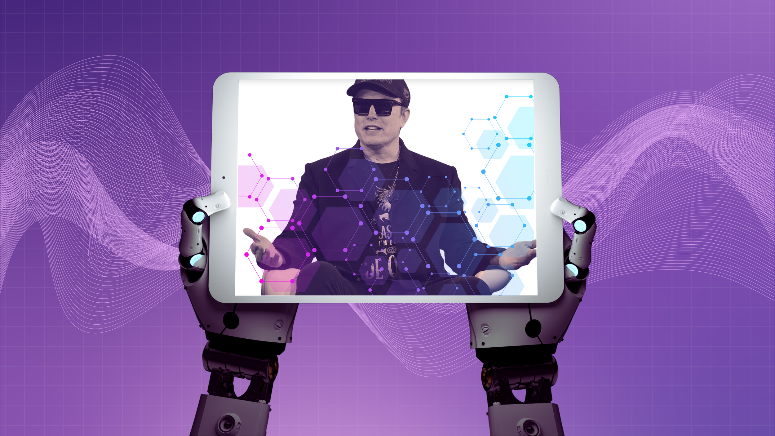
Between Musk and the Machines
Wikipedia is stuck in the middle as AI integration continues, while political critics seek to control it.

More 2 Marketing | How Brands Can be Successful on Wikipedia
On this episode of the More 2 Marketing podcast, Bill Beutler sits down with Susan Walsh to discuss the importance of having a Wikipedia presence in establishing legitimacy and credibility for your business.